Translating Data Into Journalism
How visualisations can be used to communicate a story in a more compelling way.
WEBINAR DESCRIPTION
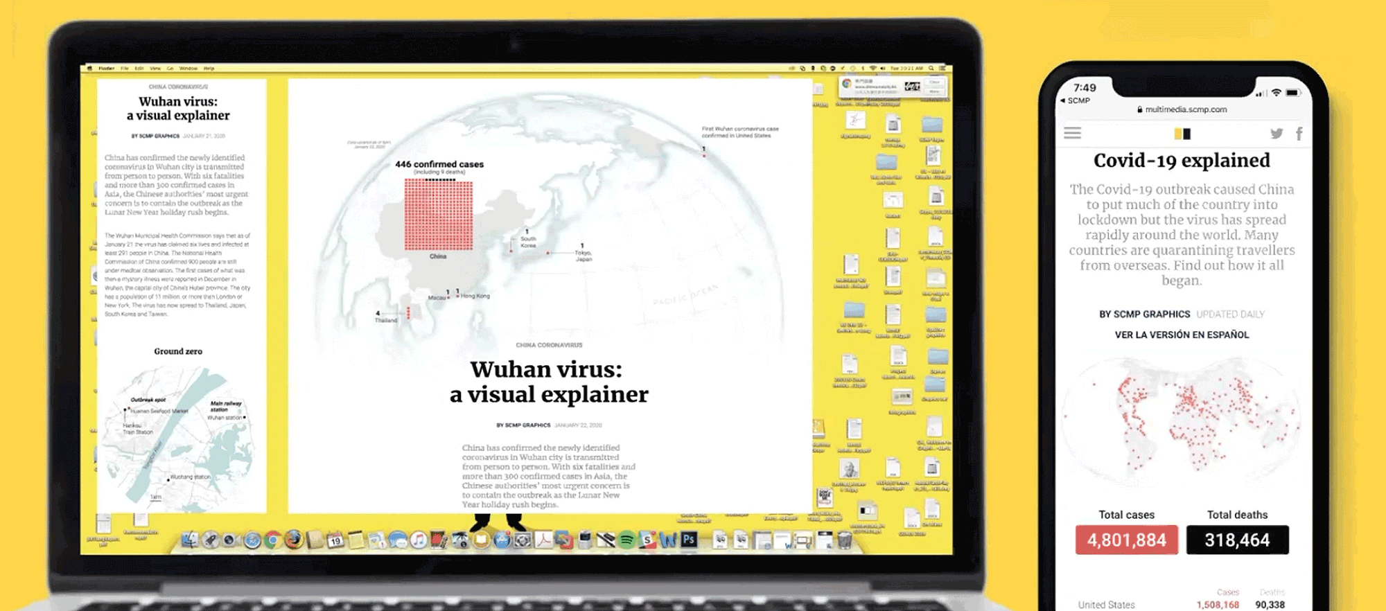
Darren discusses how his experience as the creative director, in which he works to bridge the gap between the editorial team and the creative team, have helped him gain a greater understanding of how visualisations can be used to communicate a story in a more compelling way. He goes through examples of stories they’ve done on COVID-19 to show how the data needs to tell the story, as opposed to simply just backing up the argument. As for maintaining a strong audience, Darren emphasises how the data needs to maintain a focus on the human aspect of the article.
AUTHOR
Darren Long, Creative Director at South China Morning Post

Languages: English
PRODUCED AS PART OF
DATAFEST TBILISI 2020
SUPPORTED BY IWPR