Making Realities Visible in Data Journalism
How to use illustration, data visualisation and animation to present information in a coherent and engaging way.
Towards Freelance Journalism
The main goal of the course is to educate aspiring and experienced journalists from Central Asia how to write quality stories and become a freelance journalist.
Data Sketches: A Year of Exotic Visualisations
This webinar describes the process of putting together data visualisations through three primary steps: Data, Sketch, and Coding.
Data Reporting on COVID-19 in Southeast Asia
How different outlets have reported on COVID-19 and used data to give a greater understanding of the issue.
Translating Data Into Journalism
How visualisations can be used to communicate a story in a more compelling way.
Analytical Journalism
This course is designed for novice and trainee journalists who want to understand and begin to produce analytical materials.
How to Make Decisions in Visualisation
In this detailed presentation Albert Cairo gives a crash-course on the subject of data visualisations.
Visual Narratives to Connect
In this webinar Federica Fragapane discusses her design process to create visualisations that will maximise communication with the reader.
Digital Democracy or Data Exploitation?
A discussion on how your personal data is used in politics to target you in ways that benefit a politician or particular political group.
Creating Empathy with Data Visualisation
A Design Exploration by Gabrielle Merite, an independent data visualization designer, USA.
Capturing Video
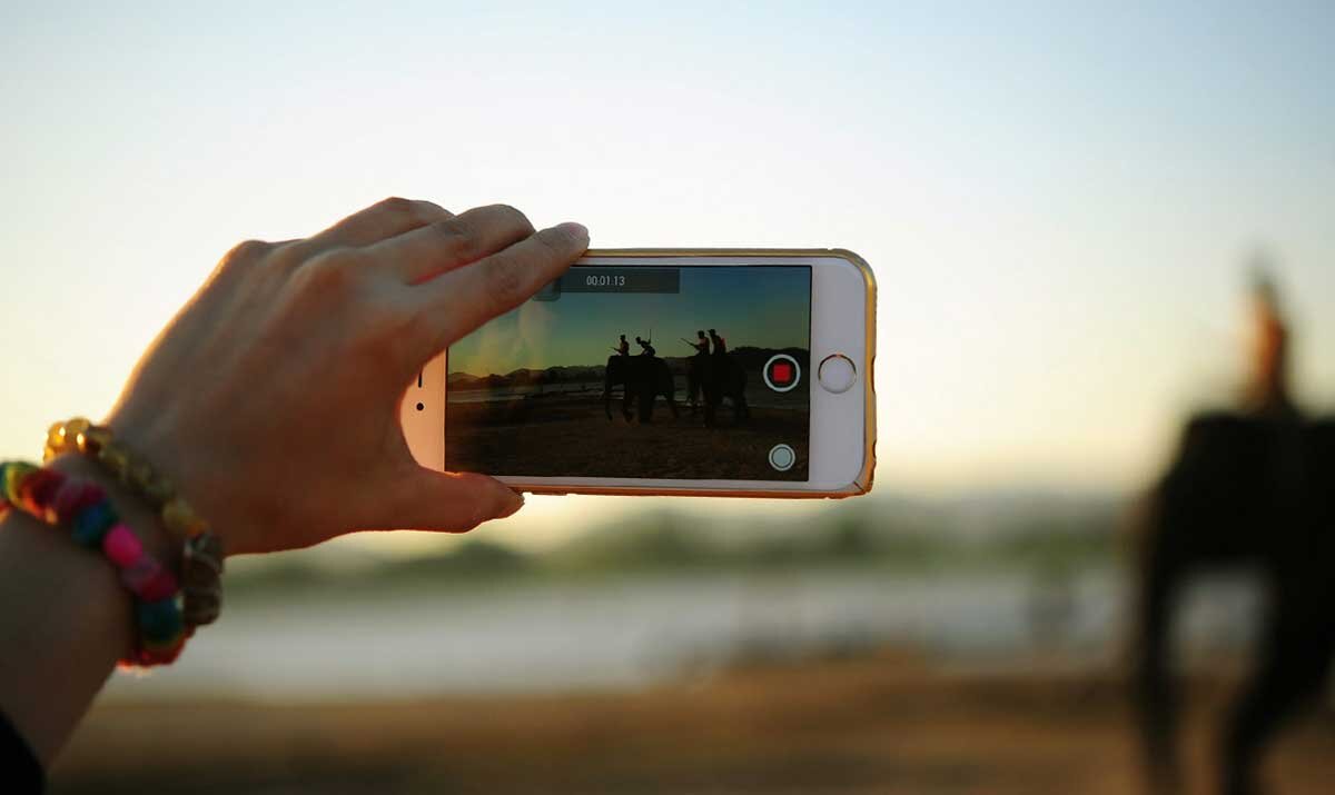
This course looks at the production of video materials in a closed-captioned digital video format for circulation on social networks.
Computer Vision to Solve Real-life Problems
A practical workshop that goes through the steps of how to use AI in your own work.


